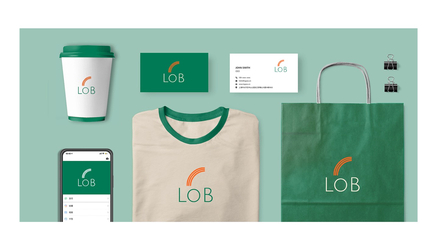
The 'LOB' logo presents a striking balance between modern minimalism and impactful branding. It features a bold, sans-serif typeface that conveys stability and professionalism, while the trio of ascending curves above the lettering injects dynamism and suggests a forward-thinking ethos. This logo aims to create an instantly recognizable identity that encapsulates the essence of the brand it represents.
(MY APPROACAH)
The design approach for the 'LOB' logo was to distill the brand's core values into a simple yet powerful visual statement. By choosing a strong, clear font and pairing it with an abstract mark, the design achieves a memorable impact without unnecessary complexity. The curves offer a visual play that breaks the static nature of the text, providing a balance between a grounded name and the idea of motion and progress.
(VISION & INNOVATION)
The vision behind the 'LOB' logo was to encapsulate the brand’s ambition for growth and excellence. The ascending curves symbolize upward movement and success, aligning with the brand's aspirations to ascend in their industry. The vision extends to crafting an identity that is not only timeless but also flexible across various platforms and scales.

(CHALLENGES)
One of the primary challenges addressed by the 'LOB' logo was the need for versatility. A logo that remains effective on both digital platforms and print materials, from large-scale signage to the tiny confines of a mobile app icon, requires careful consideration of scale, detail, and color. Overcoming this challenge, the logo maintains its integrity and impact across all applications.
(PROBLEMS)
The logo tackles the problem of brand differentiation in a saturated market. With its unique combination of typeface and graphic elements, it avoids clichés and sets the brand apart from its competitors. The problem of creating a lasting first impression in the fleeting attention economy is also addressed through the logo’s distinctive and bold design.

(USER-CENTRIC DESIGN)
In the user-centric design of the 'LOB' logo, attention was paid to how the logo is perceived and remembered by the audience. The use of vibrant colors and clear typography ensures that the logo is accessible and appealing to a wide range of users, fostering brand recall. The design reflects an understanding of the importance of user engagement and the logo's role in facilitating a connection between the brand and its customers.
(USER NEEDS)
The 'LOB' logo caters to the needs of users who seek confidence and clarity from the brands they interact with. The straightforward design assures users of the brand's directness and reliability. The energetic colors speak to users’ desires for a brand that is alive and innovative, fulfilling their need for a progressive and trustworthy business partner.
This holistic approach to the 'LOB' logo's design ensures that it not only represents the brand's internal values and goals but also resonates with the external audience, meeting their expectations and fostering a strong brand-user relationship.